Chapters
How to use it effectively
General Guidance
- Take the time to actually read the content and start to map out which parts should be grouped into different sections
- Sections that are about a single subject should typically be kept together, generally think of section dividers as “idea dividers”
- Two column layouts will be your most common ally, use them often.
- Keep an eye out for blocks of content that can easily be divided into three or four columns (or multiples thereof)
- Keep an eye out for content that can be converted to bulleted lists (such as a paragraph listing a whole bunch of comma separated items)
- Don’t be afraid to space content out A LOT. Something we always talk about with clients in our initial strategy is the importance of “measured content pacing”. See the above note on measured content pacing under “Why is it important?”
Section Guidance
Alternating
- Though not always the case, it’s generally a good route to alternate the use of no background sections with light or dark background sections.
- This helps segment the content visually, hopefully also segmenting the different “ideas” on the page
Text Alignment
- A pretty universal rule is that each section should have the same text alignment applied across all text within the section (all left, or all centre aligned)
- Differing sections can have differing text alignments. Example:
- Section 1 – All text within left aligned
- Section 2 – All text within centre aligned
- Section 3 – All text within left aligned
Stacking sections of the same style
- White or no background sections are always good to stack (just remember to use the “Remove bottom spacing” option when doing so to prevent enormous amounts of space between the sections)
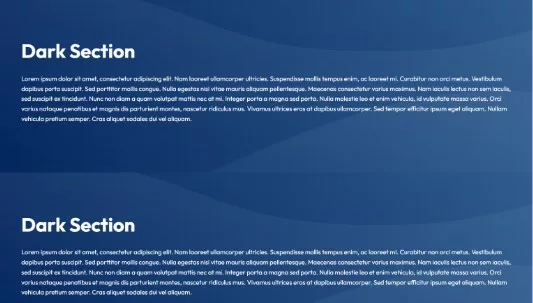
- Light or dark background sections should generally not be stacked on top of each other as the background images and/or accompanying graphics can sometimes negatively interfere with each other. Example:

- In some cases, light and dark sections can be stacked on top of each other. Example:

Column Guidance
One Column
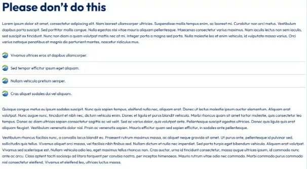
- Should NOT be used for long-form content like full paragraphs, example:

- Should typically be used for short headings and/or up to a few sentences.
Should often be centered horizontally, and make use of the “Reduce Content Width” option
Example:
Two Column
- Typically the most common layout to use
- Common techniques for splitting content are:
- Text on one side, photo on the other
- An effective use of this layout is alternating the photo and content in multiple sections if necessary, such as:

- Heading / large text on one side, text on the other

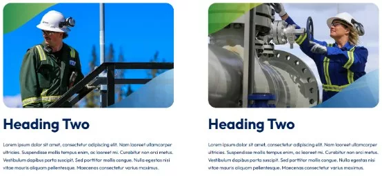
- Image, heading and text on both sides

Three / Four Column
- Three or four column layouts should only be used to house very small bits of content. Typically nothing more than a heading and a few sentences.
- Often it is nice to accent these with images or icons (have to ensure they are the same height across the columns to maintain proper alignment)
- Often these layouts work well with centered content
- Example:
